Top 5 Singapore restaurant website designs.
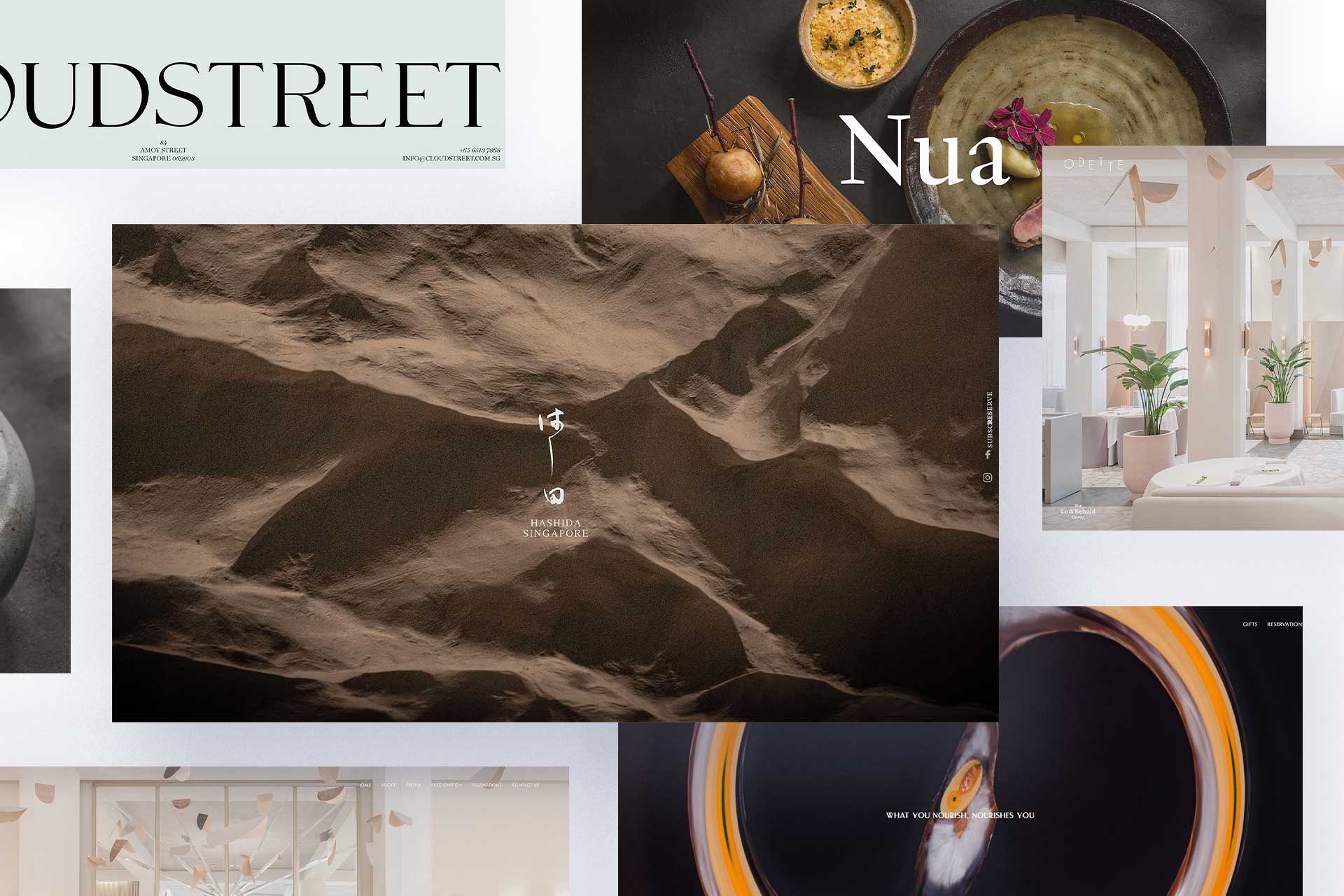
For most restaurants, the ability to attract new patrons is paramount to the growth of their business. 75% of consumers surveyed choose a restaurant to dine at based on search results. That translates into having great reviews and a stunning website. Here are 5 restaurant websites in Singapore that we like and why.
Table of Contents
That translates into having great reviews and a stunning website. Here are 5 restaurant websites in Singapore that we like and why.
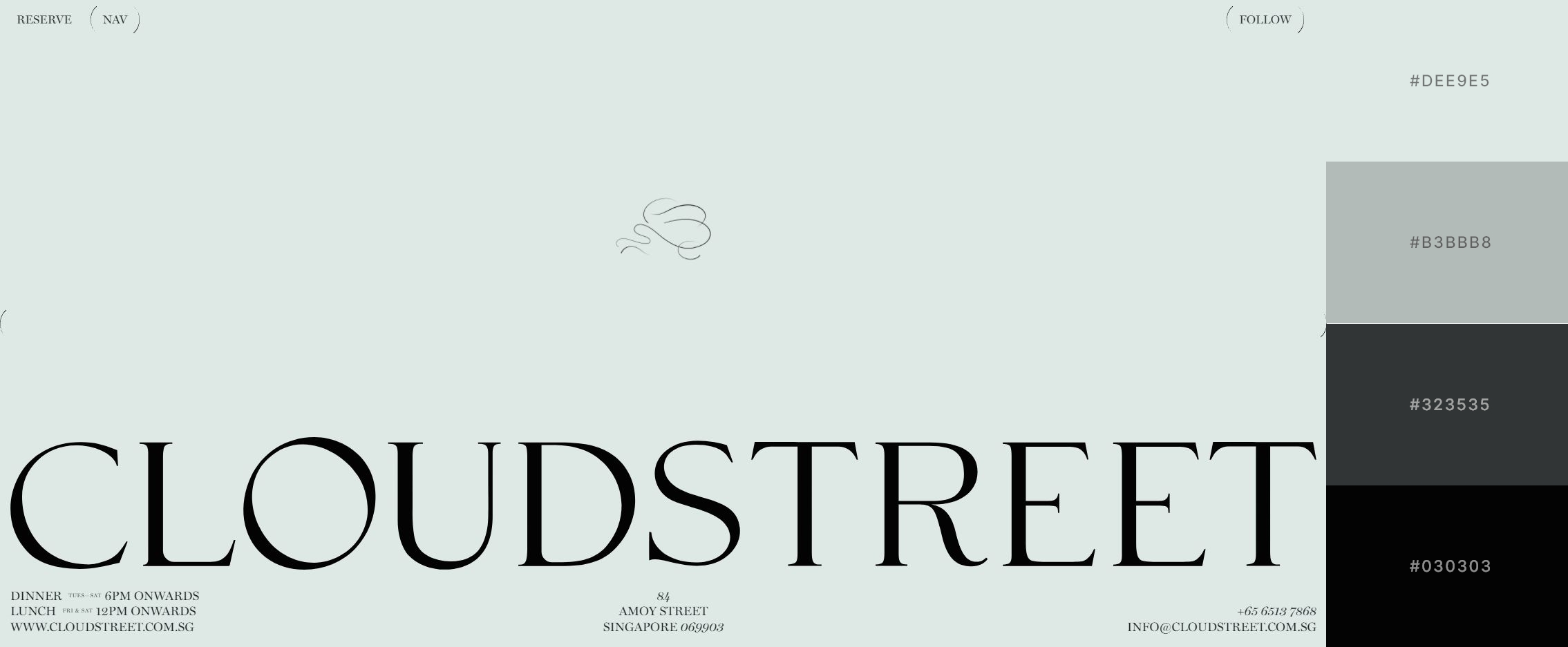
Cloudstreet presents a progressive yet sophisticated approach to gastronomy – marrying disparate cultures and influences in an exuberant expression, it champions ingredient-driven cuisine and seasonality.
Their website was designed in a style that allowed them to stand out from other restaurant websites in the local scene. They use a colour palette that no other website uses to immediately have a distinct look and feel to them. The boldness in their typography usage to be the main visual while other restaurants always use images is refreshing to us.
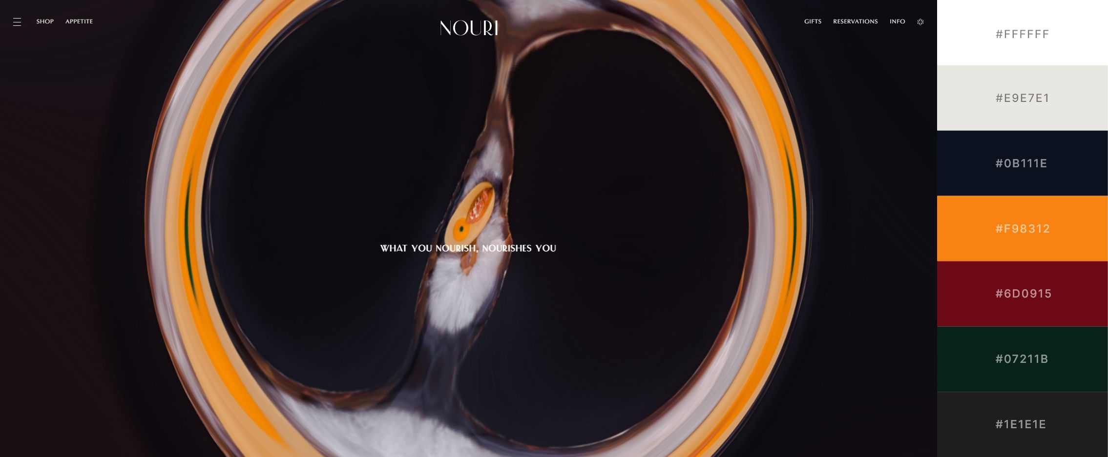
Nouri is a place that celebrates people, in all our differences and similarities. A restaurant that nourishes not just body and mind, but the liminal bond between the “you” and the “I”.
This was designed primarily as a one-page website. The landing page posts a question and a swirl effect video banner that is intriguing, a good way to get people to continue scrolling. They used animated scrolling to transit to a bold and contrasting colour whenever you scroll to a new segment. This creates a unique navigation experience which stood out
for us.
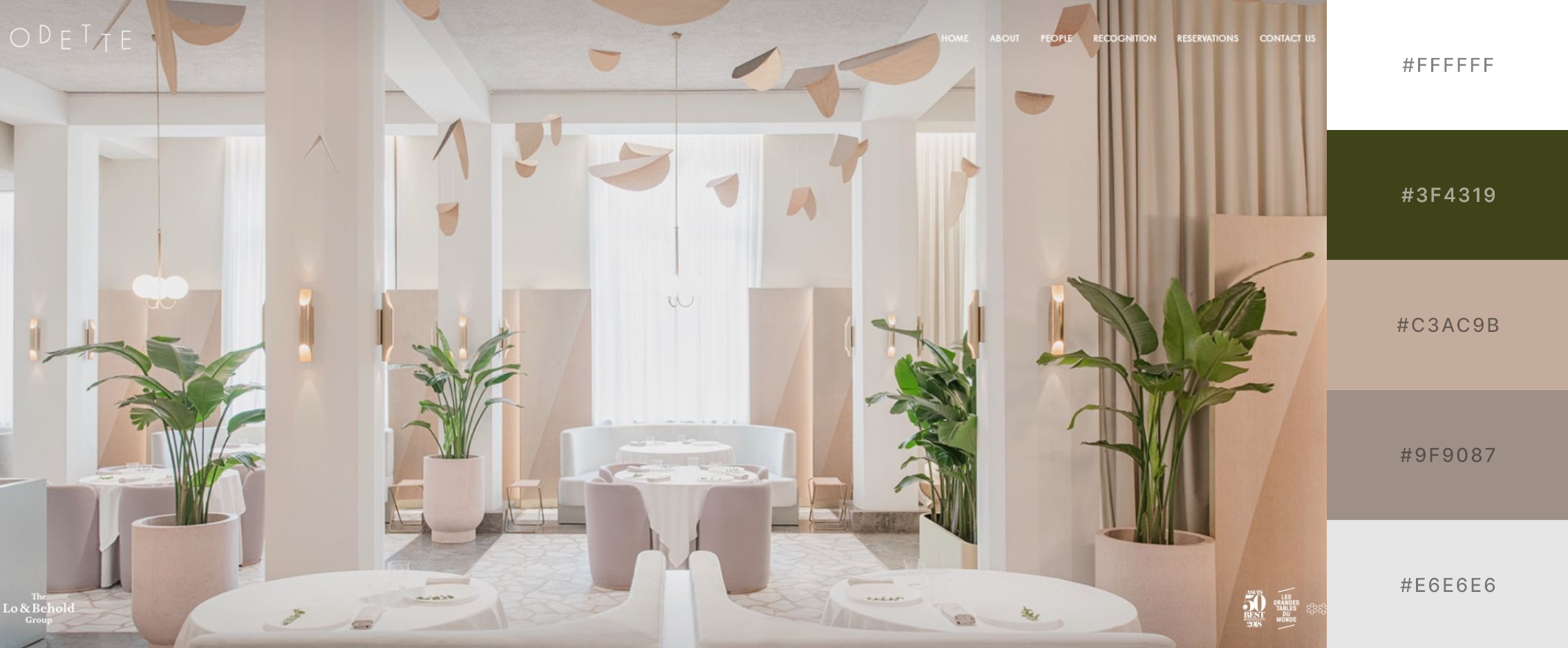
Odette was voted #8 on The World’s 50 Best Restaurants list. Odette serves modern French cuisine guided by Chef Julien’s lifelong respect for seasonality, terroir and artisanal producers sourced from boutique producers all over the world.
The website exudes a minimalistic and classy design that shows that less is more. What made the website stand out was the content planning that really gives the visitor the perception of a one-of-one experience when they dine there. Pages like Chef’s letter and People we admire provides an insight into the head chef, his philosophy and dishes.
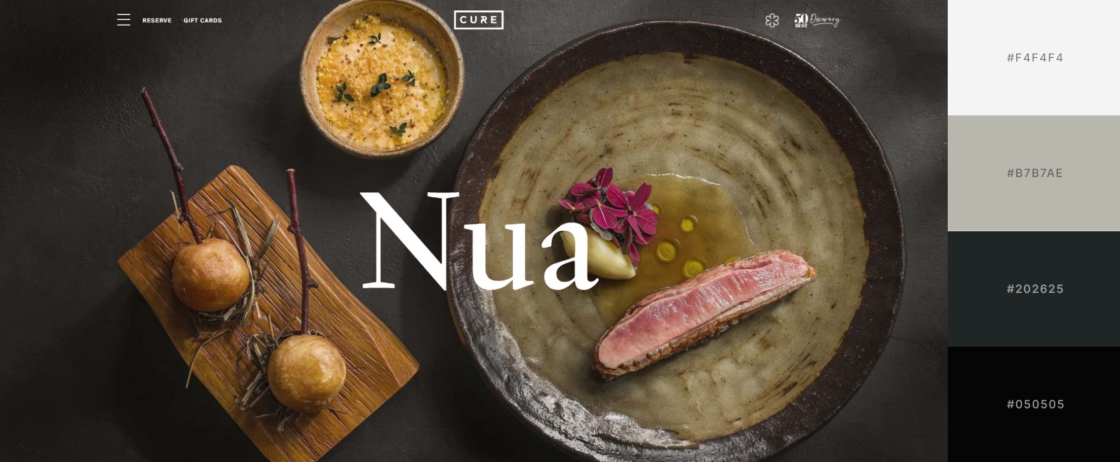
Cure is Andrew Walsh’s first venture as Chef-Owner and is a restaurant that is rooted in combining top-notch plates, solid drinks and personable service that is delivered in a casual yet refined environment.
The first thing that stands out is the initiative to match the colour scheme of the website with the images, which are front and center when you first enter. This website follows more of a grid-style design, which keeps everything clean and neat even for a site with a lot of text content. We liked how the pop-up menu was designed, where they utilized the whole screen and used good content hierarchy and size to introduce all key points of Cure within the menu itself.
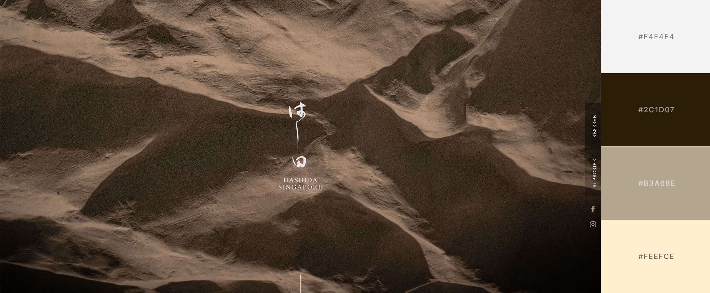
Hashida showcases a diverse array of traditional Japanese dishes with a contemporary twist. Their omakase menu features the most premium and seasonal ingredients prepared during the peak of its flavours.
The design of the website really took into account the type of cuisine and the restaurant’s branding in mind. We like the move away from food imagery as they have a minimalist landing page that speaks volumes with the logo and texture. We can see the idea behind having a one-page website where the scrolling navigation guides the visitor on the website, with every segment layout different, akin to an omakase experience.
We believe it takes a good eye to know a good one.
The reasons why we like the above-mentioned websites are also the things we make a point to achieve as. At SB web design, our team loves embarking on restaurant website designs as it gives us the freedom to create something unique for them, just like what they do for their customers.
